OPAL Environmental Justice Oregon
Brand Identity / Logo & Icon System
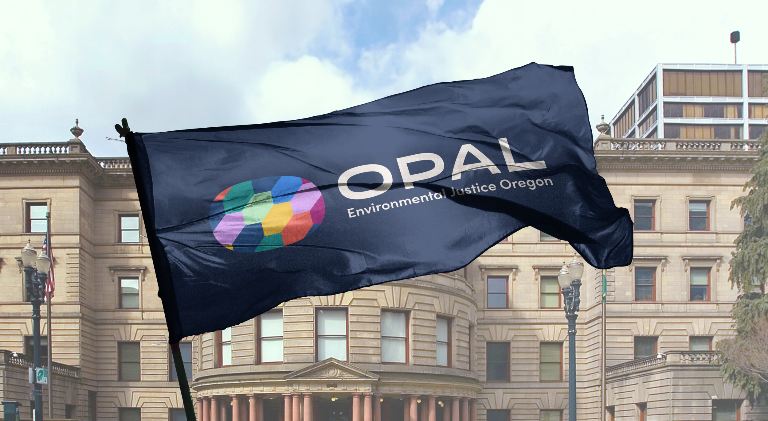
Evolving into a multi-faceted org.
Core Collaborators
Creative Direction & Design: Schessa Garbutt
Design: Gustavo Luna
About
OPAL Environmental Justice Oregon has been committed to forwarding ecological justice and transit access in the Portland area since their founding in 2006. They’ve organized around issues ranging from air quality and congestion pricing, to reducing policing and increasing bus service, and have seen dozens of victories through direct actions that hold Oregon’s public officials accountable. OPAL sought out Firebrand for a new visual identity that reflects the organization’s continued focus areas while centering BIPOC, disabled, LGBTQIA+, low-income, youth, elders, and transit-dependent people in their organizing and leadership training work.
Our Solve
When OPAL approached us at the end of 2023, there was a passion so deep that it inspired us to return to the roots of their name. Originally, emphasizing their tagline “Organizing People, Activating Leaders” gave light to what they do—but not how they do it. The Firebrand team unearthed inspiration from Oregon’s natural opal deposits, building out a brand identity system that celebrates the organization’s intersectionality, multi-faceted approach, and “we bring the party (to city hall)” spirit that has garnered respect in Portland and beyond.
Logo Story
“As the world shifts and OPAL responds, we believe it’s time to make their renewed mission and focus apparent in their brand visuals. The old brand didn’t represent the community’s diversity, warmth, and multi-facted approaches to environmental and transportation equity. All beings have a role to play in the fight for climate justice. This symbol celebrates both our unity & diversity.”
— Schessa Garbutt, Creative Director
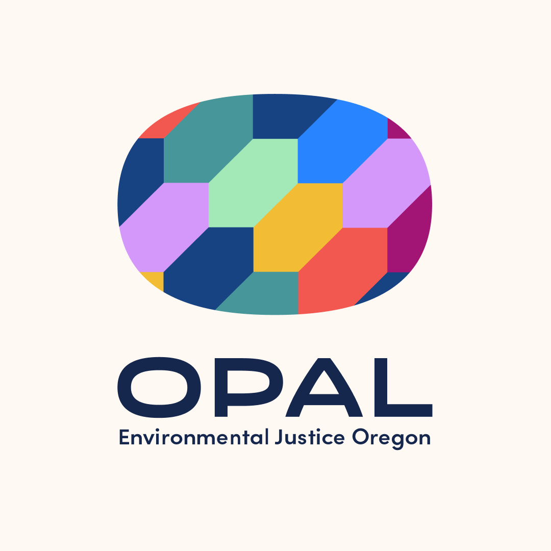
Final logomark.
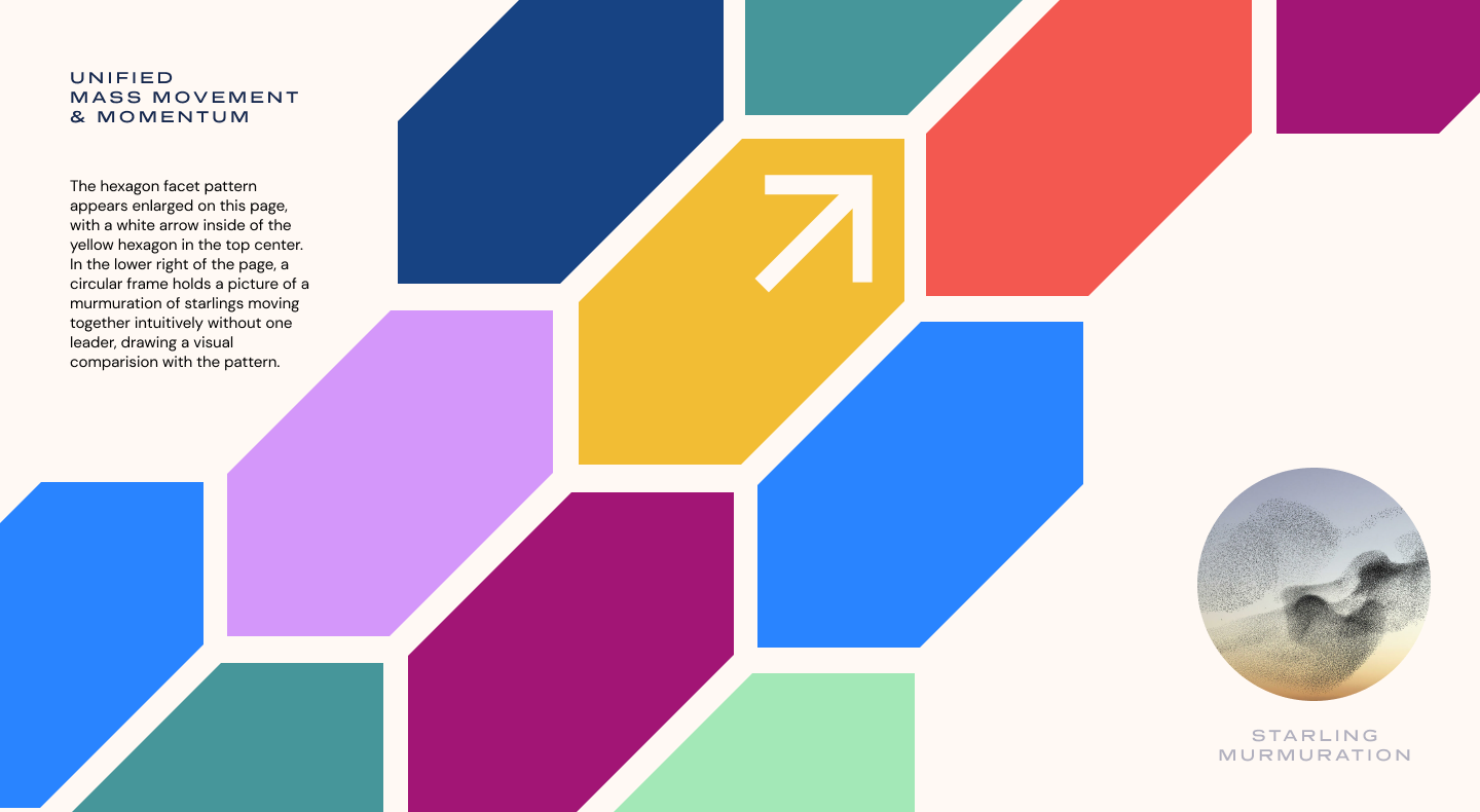
We chose this tessellating shape because of it's inherent sense of upward movement—representing unified mass movement & momentum.

The one-color version of the logo transforms into a mycelial network, connecting resources and information, just like OPAL.
The logo sits on the left side of a navy blue page. On the right, the colorful pattern of tessellating hexagon facets from the logo icon run off the edge of the page.
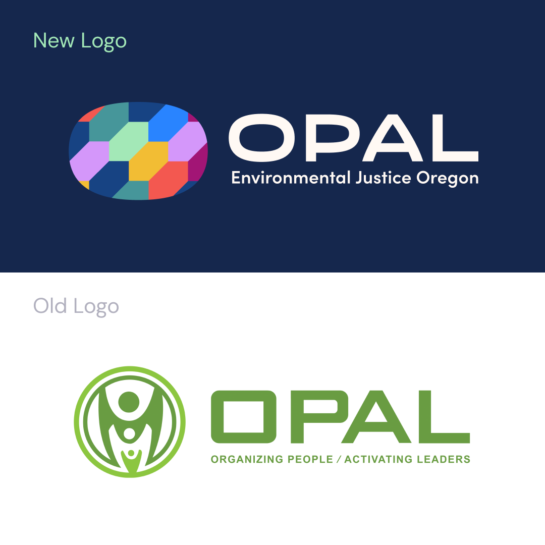
OPAL's new logo design above their previous design. The leadership team wanted to move away from their previous icon which read as (literally) centering a white person and hierarchy.
Our favorite part of the process was the exploration stage. We had an easy time coming to a consensus with the “wildcard” option, which perfectly captured where our organization currently finds itself. It was affirming to know Firebrand really captured our essence and was deeply listening to our triumphs and struggles alike.
— Marina Sáenz, M.Ed., Communications & Narrative Strategy at OPAL
Logo System for Initiatives
OPAL’s multi-faceted approach includes three initiatives: Bus Riders Unite!, Seeding our Liberation, and Youth Environmental Justice Alliance. They each use one facet shape from within the primary logo to create a unifying framing system across the groups.
Working with Firebrand has been a dream! Our team had specific accessibility needs and we found Schessa to be accommodating on all fronts. We have been looking for a high quality design team that aligned with our social justice values and could not be more happy with the results.”
— Marina Sáenz, M.Ed., Communications & Narrative Strategy at OPAL
