Confess
UI/UX / Brand Identity / Editorial Design / Packaging
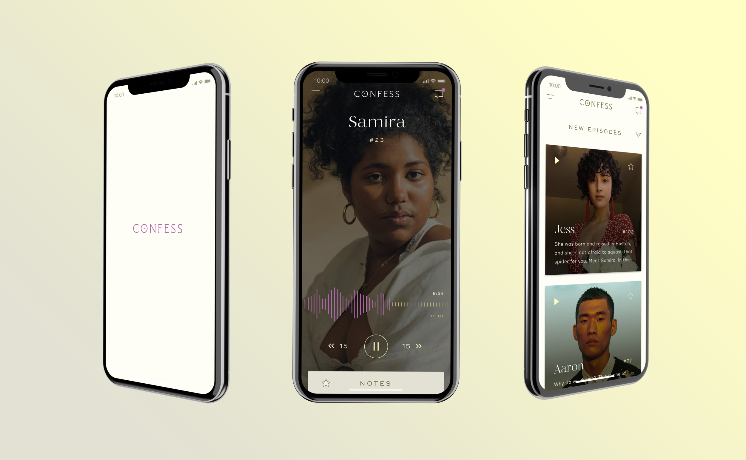
Skip the small talk. Confess.
A Firebrand Special Project.
Invest or join as a beta member here.
Concept, Identity, & UX/UI: Schessa Garbutt
About
Currently, dating app users are plagued by dry profiles and endless swiping. The Confess team wanted to design a more intimate way to connect with others, using senses other than visual. What if we could hear and read one another’s stories? What if we had help telling those stories?
Our Solve
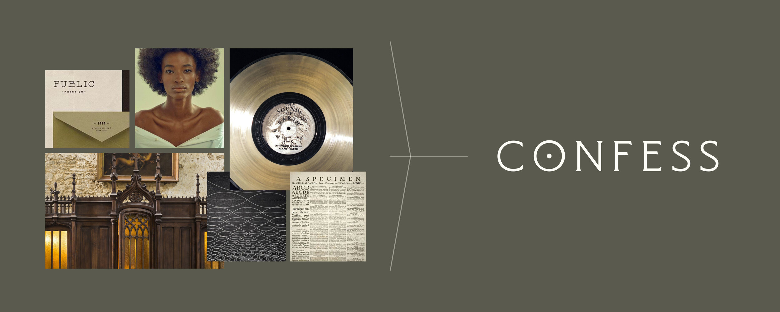
Following the principles of calm tech, we designed a digital experience that was intuitive and safe while also creating intimacy and excitement. Building off of the double entendre of the name, the brand language and visuals play with religious and recording studios metaphors. We also worked together to create a quarterly zine and card game for those that want to connect offline and in person.
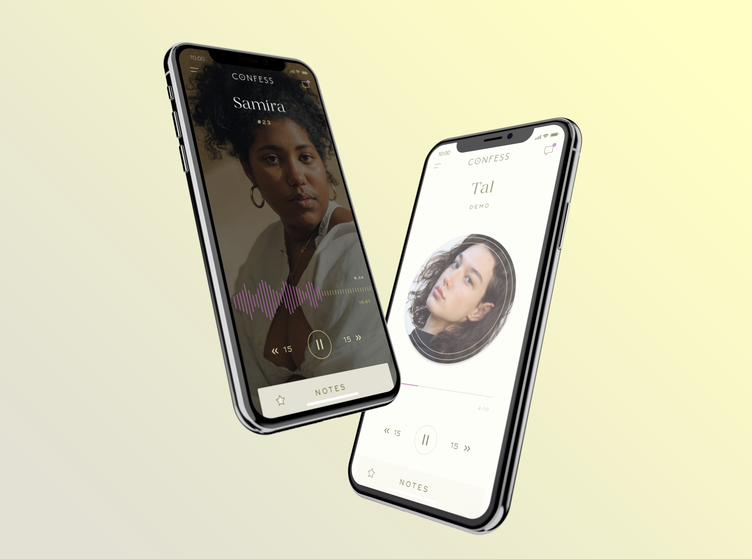
The Digital Experience
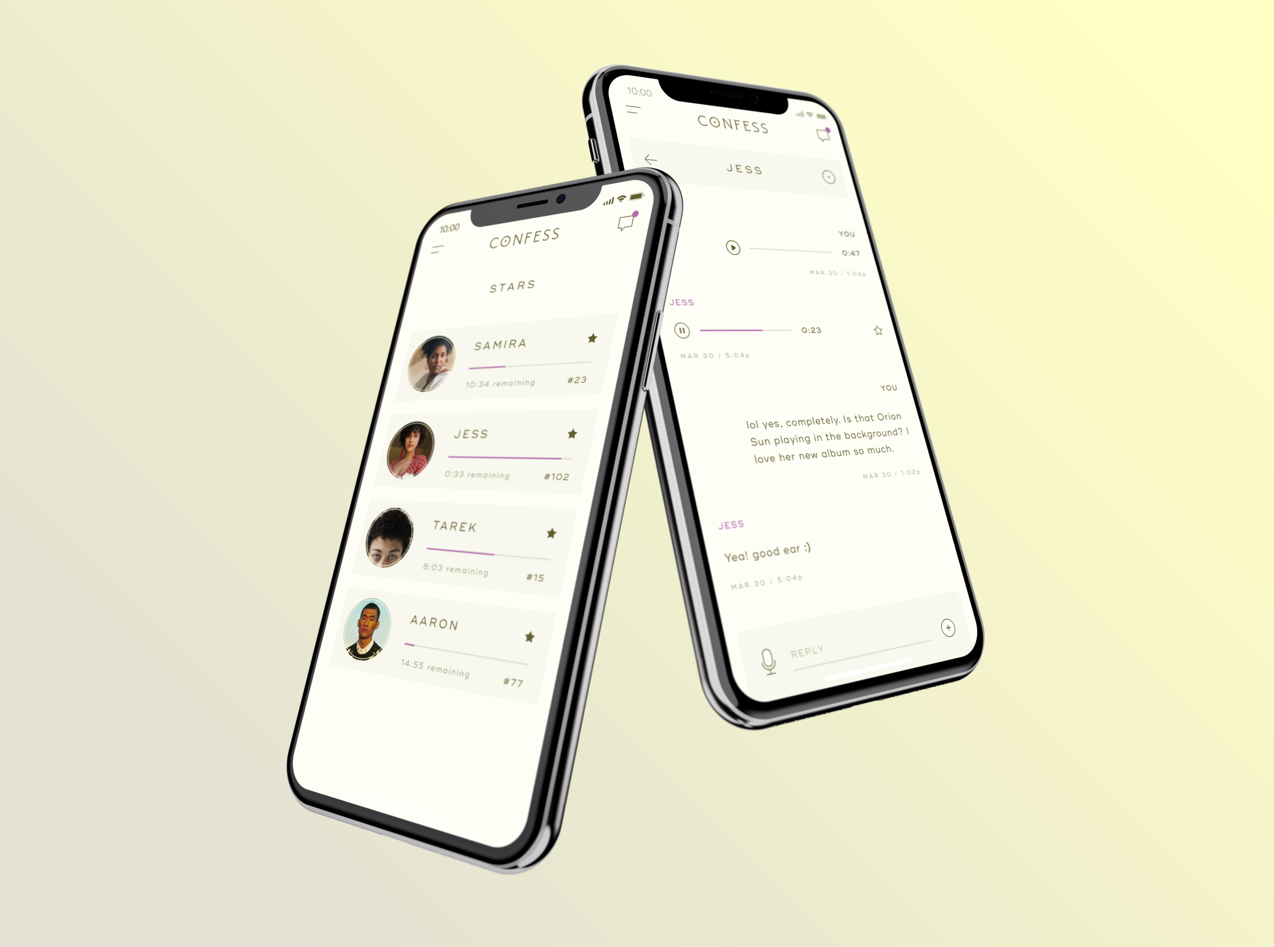
While waiting to be interviewed, users can record a short 2-minute audio ‘Demo’ about themselves. In addition to browsing and listening to profiles, users can message one another (& send voices notes, of course), as well as save profiles to listen later.
The Offline Experience
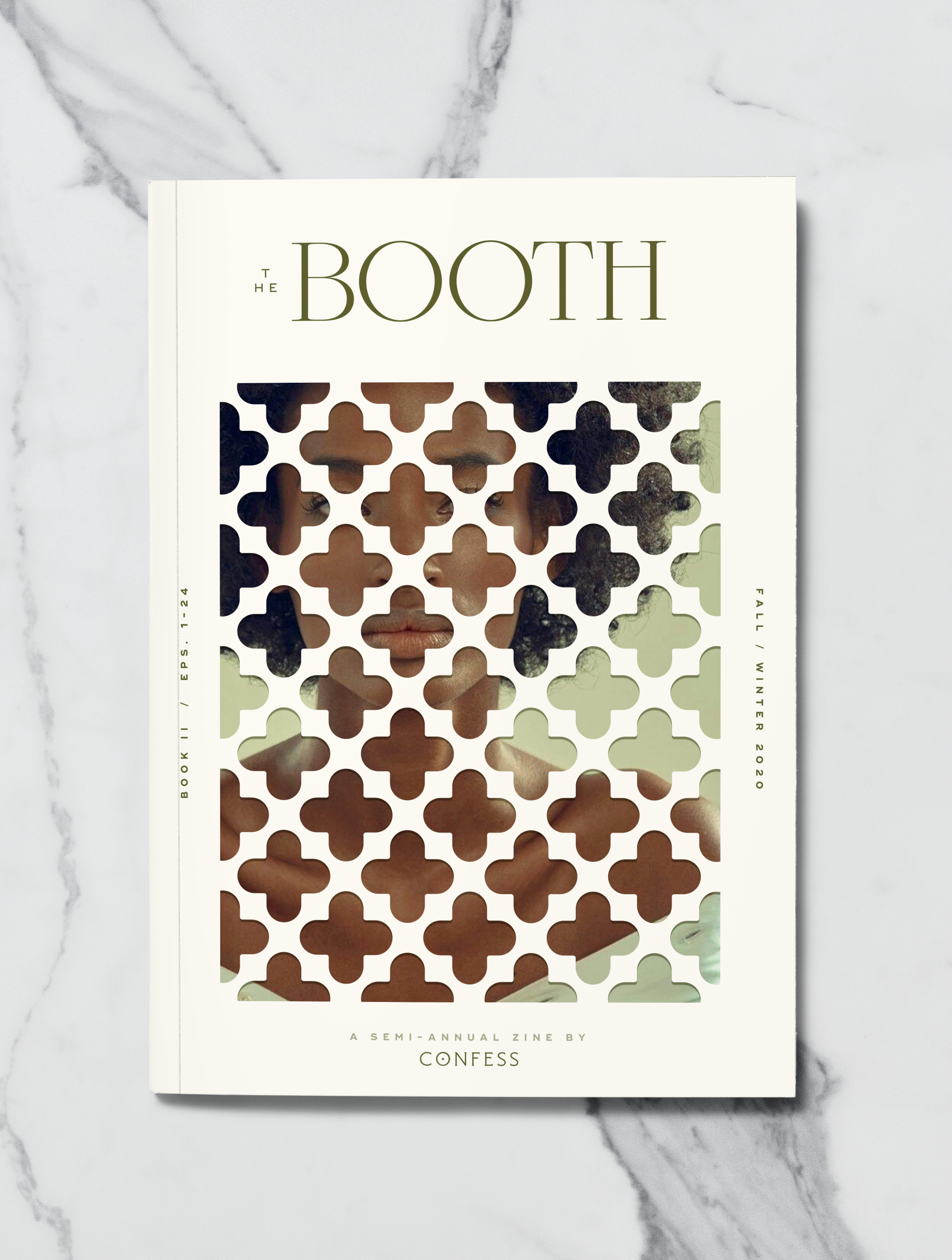
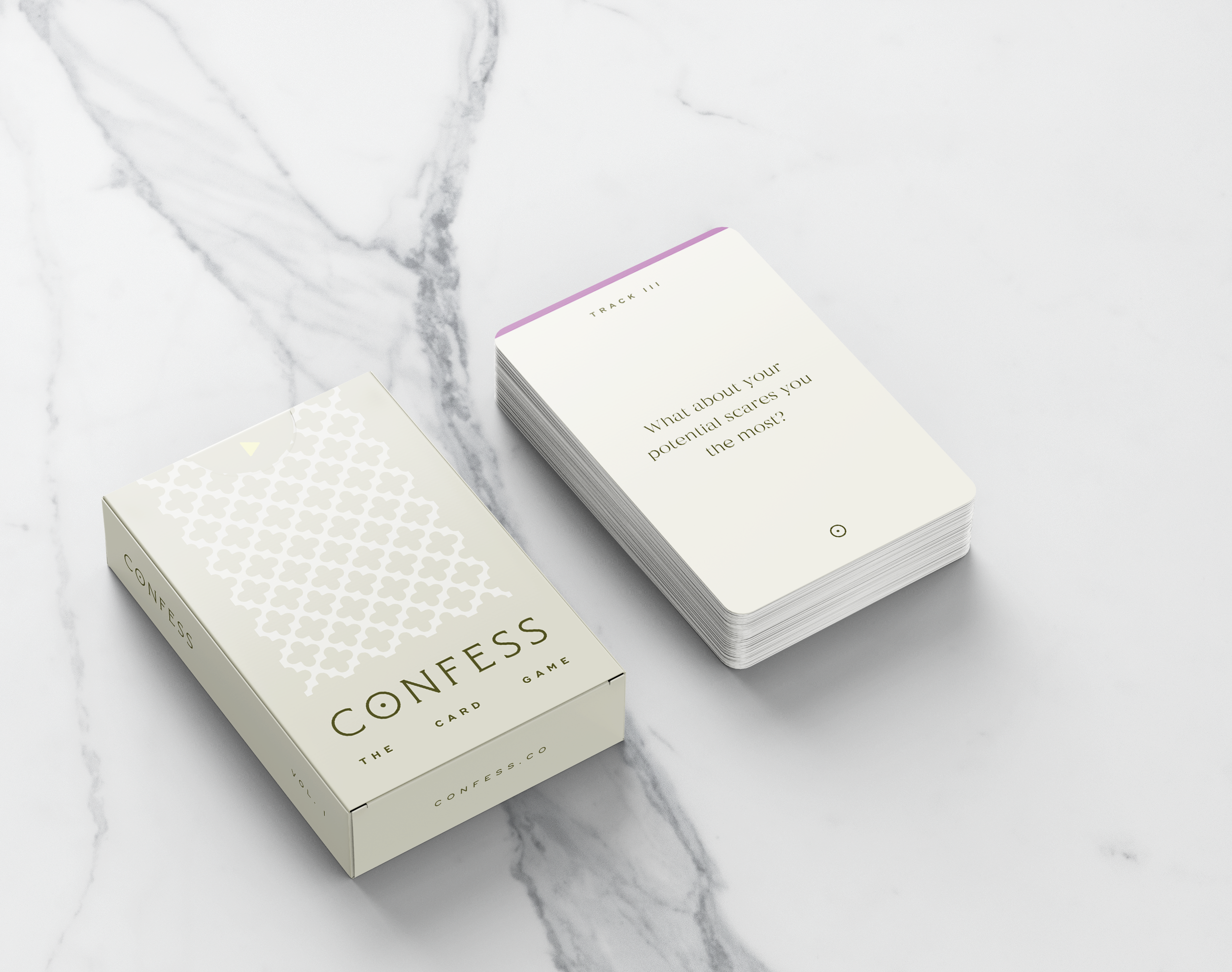
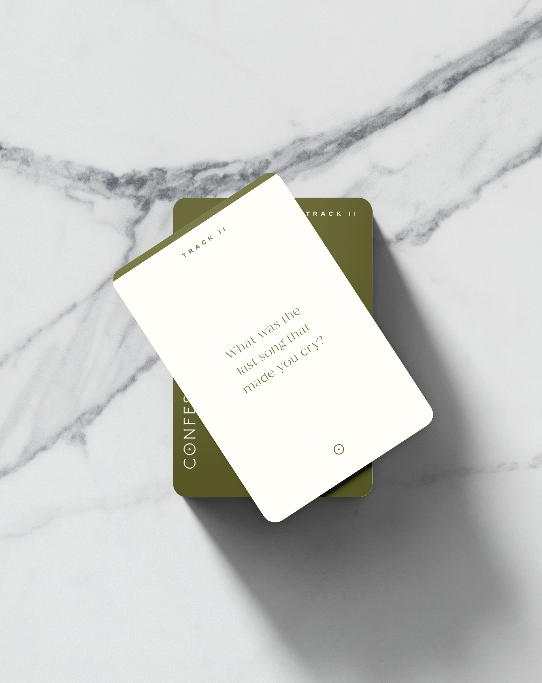
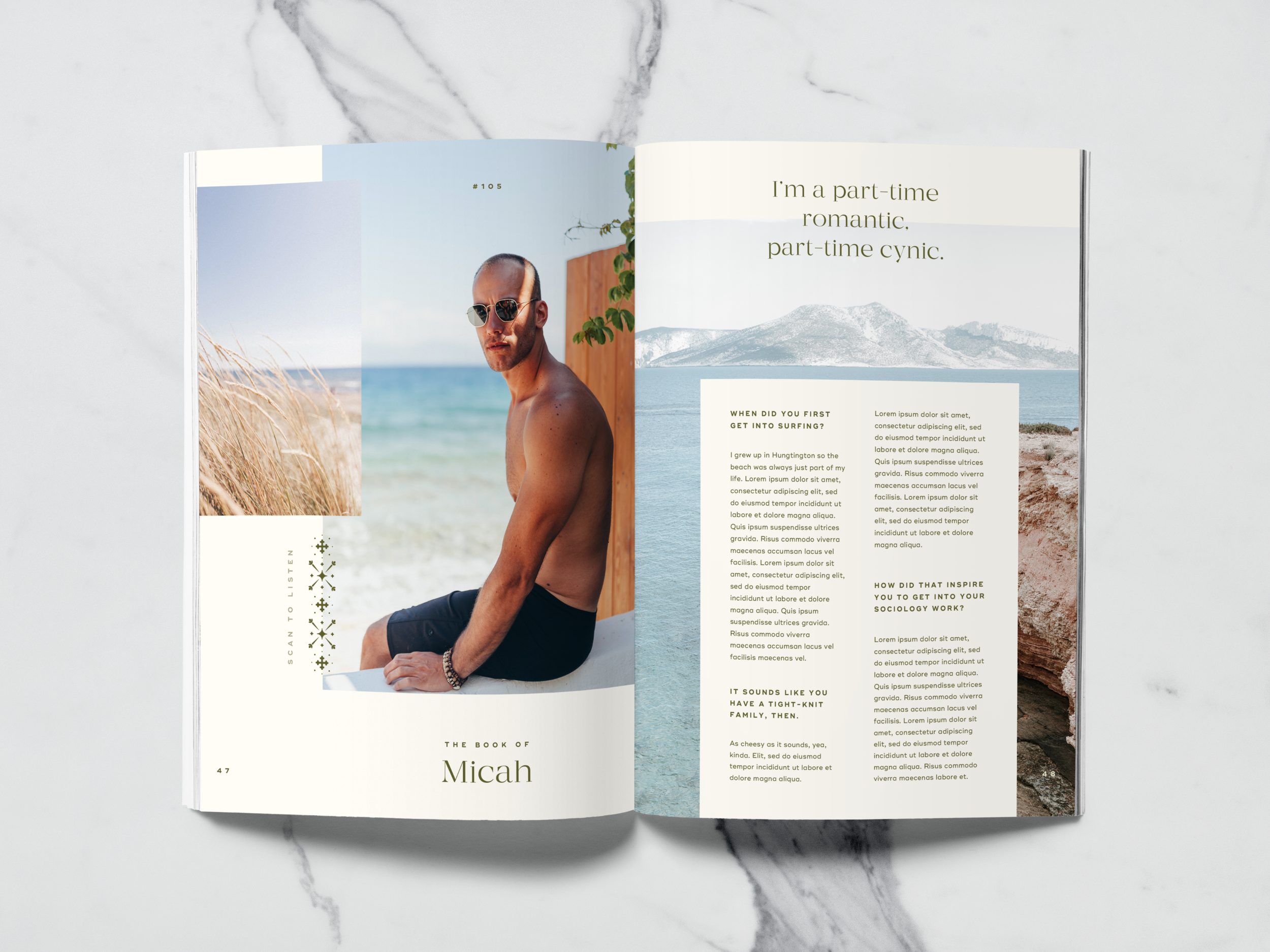
We suggested that Confess engage another sense: touch. The Booth quarterly magazine would feature transcripts of the most popular interviews of the season as another way to connect. Confess: The Card Game lets users interview one another offline with Confess’ curated questions, making date night a little more special.
Confess is currently in development.
Invest or join as a beta member by contacting us here.
