Hello Again
Brand Identity / Packaging
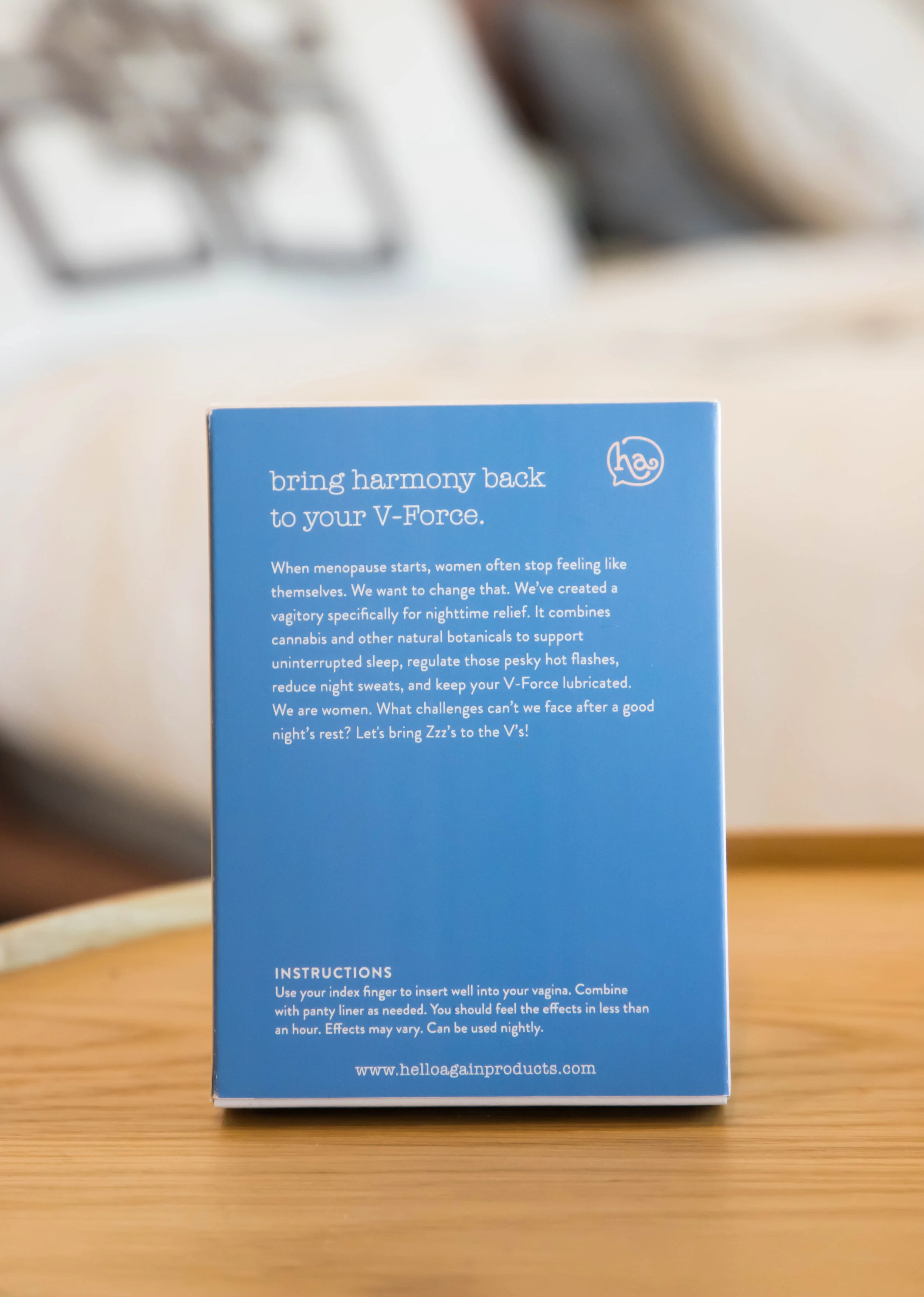
Bringing harmony back to the V-Force.
Awards & Press
Forbes
The Dieline
2020 GDUSA American Packaging Design Award Winner
Agency: Clever Creative
Box Photography: Anthony Perez
Identity & Packaging Design: Schessa Garbutt
About
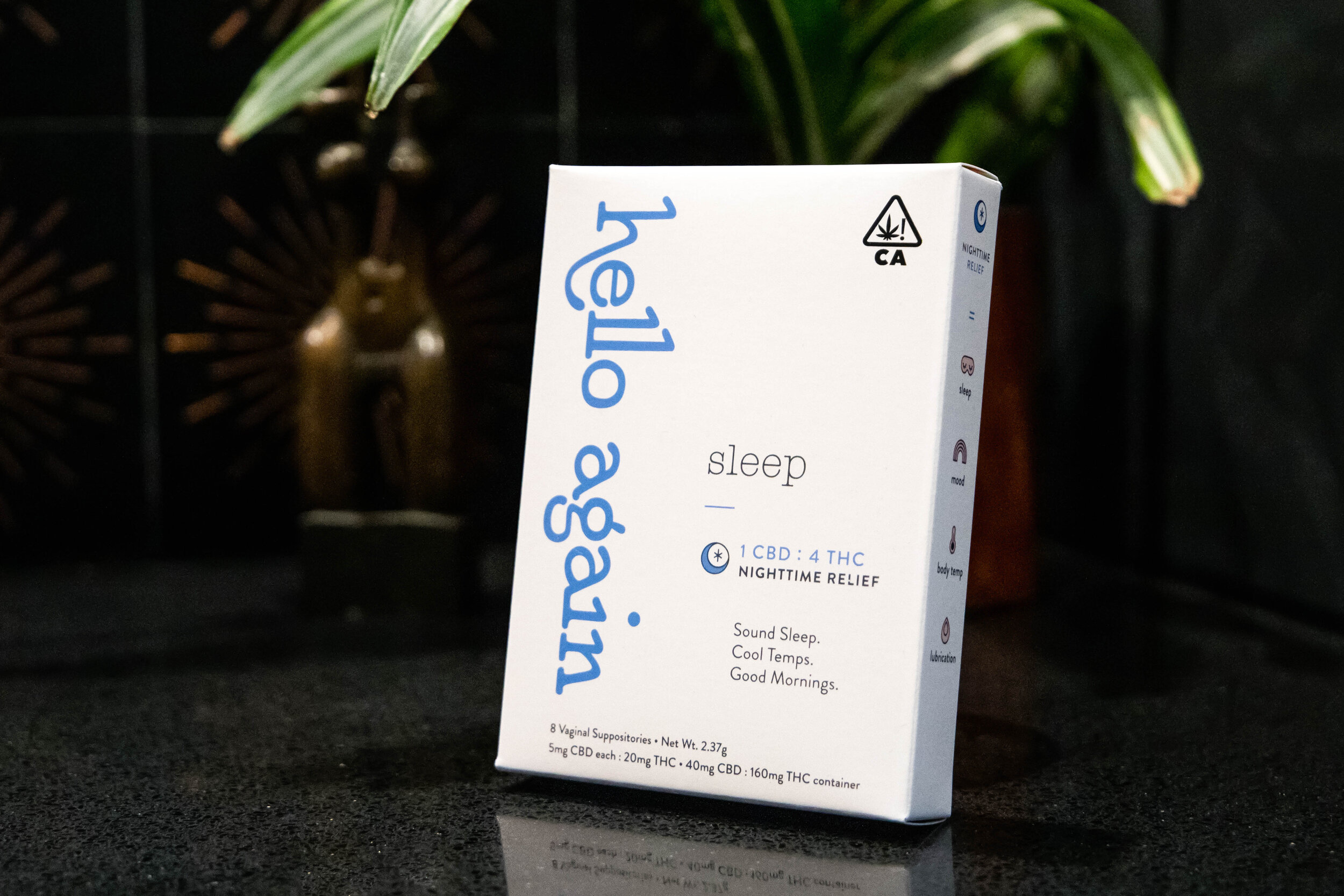
When menopause starts, women often stop feeling like themselves. Thankfully, Mother Nature has our backs. Hello Again combines cannabis with natural botanicals, creating a formula to relieve menopause symptoms. HA is infiltrating the male-dominated dispensary space and putting conversations about women’s health front and center.
Our Solve
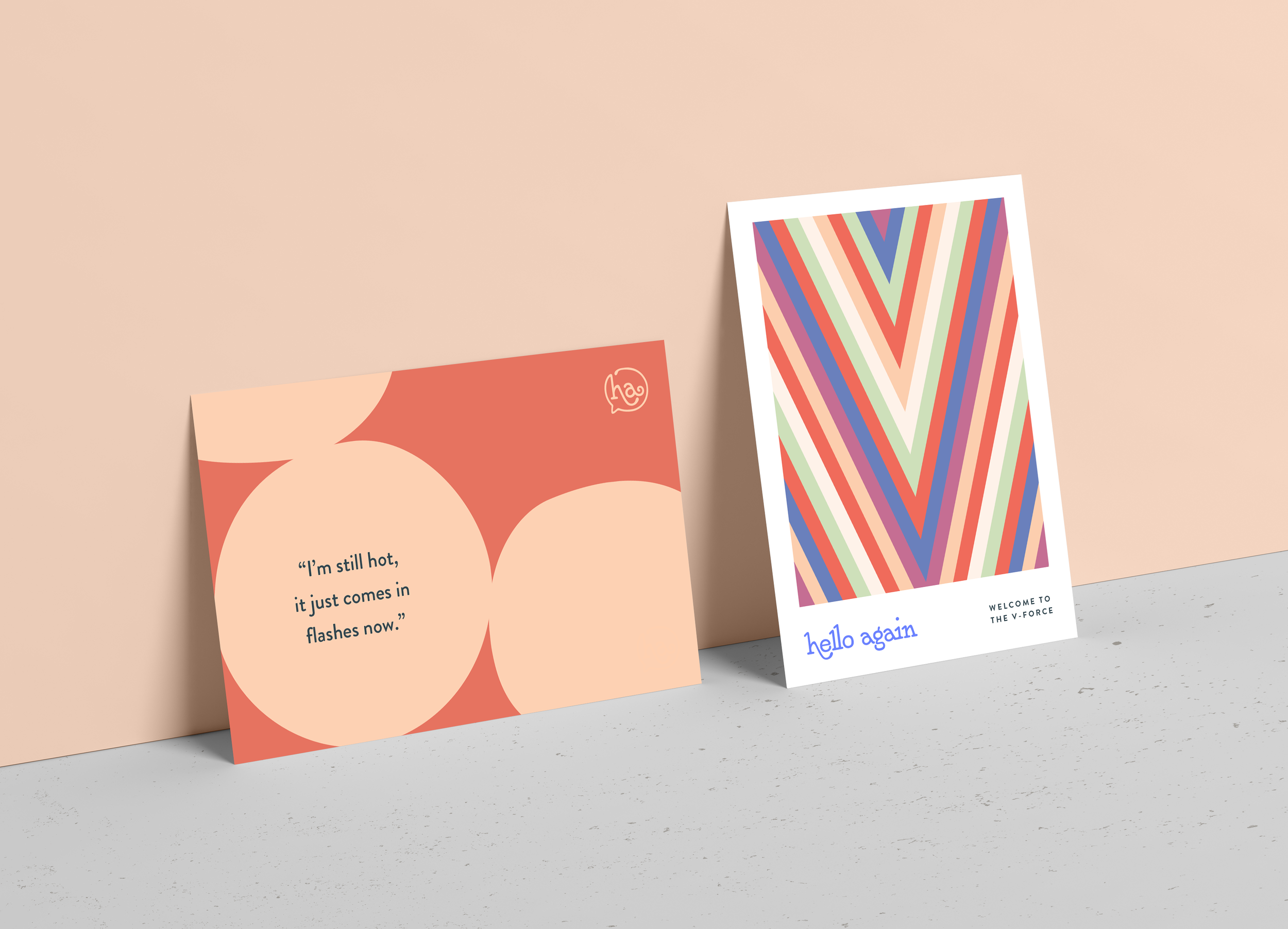
Working with the Hello Again co-founders was a masterclass in empathy. When Patty & Carry approached Clever and I with their concept, we took the time to listen and read up on real women’s experiences with menopause. Eschewing stereotypes typically associated with menopause & medical marijuana (gerontology, clinical colors, etc), we went for a punchier approach—using bold graphics and a hand-lettered logomark inspired by classic folk and psych rock records.
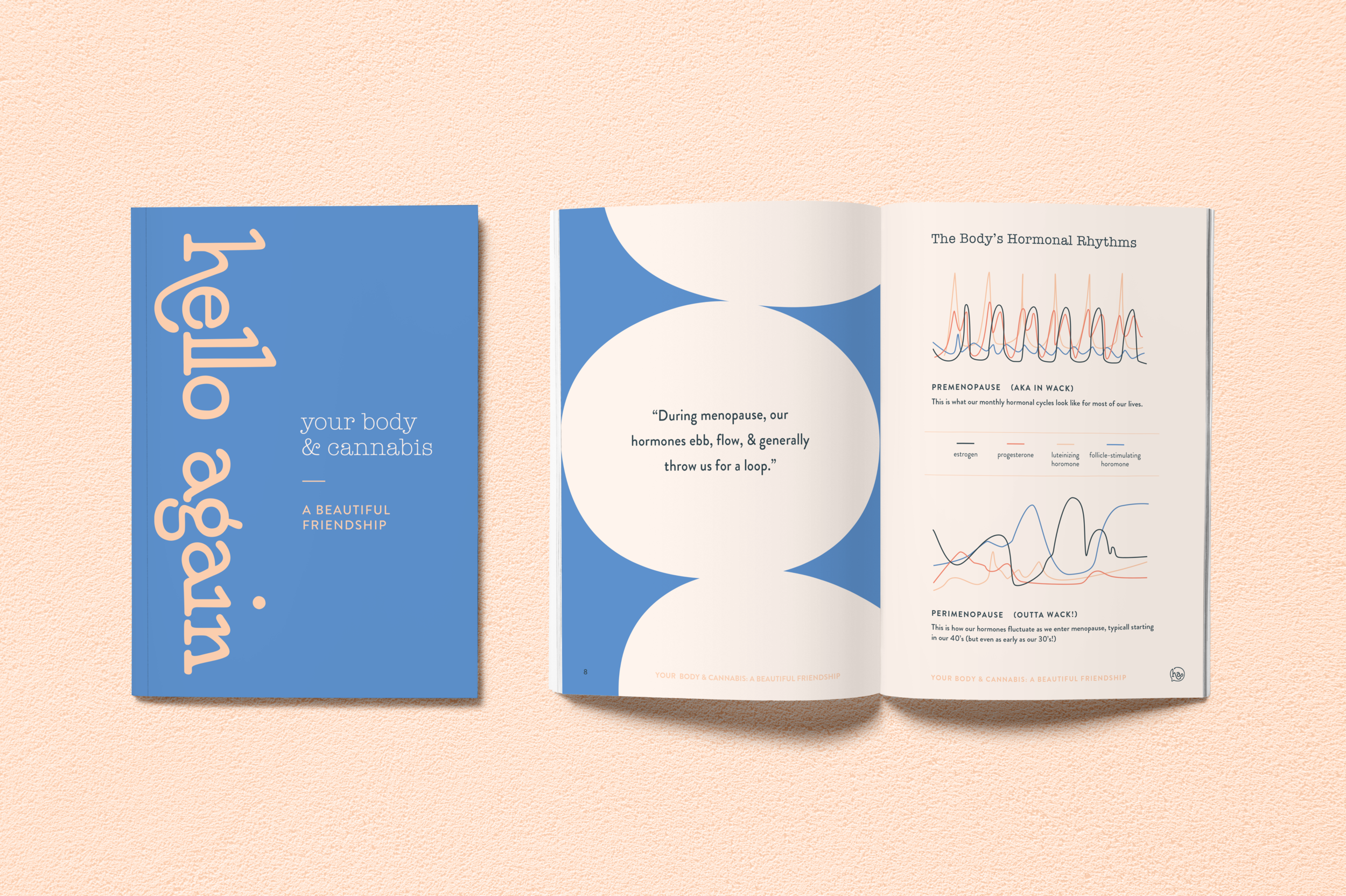
The Brand Identity
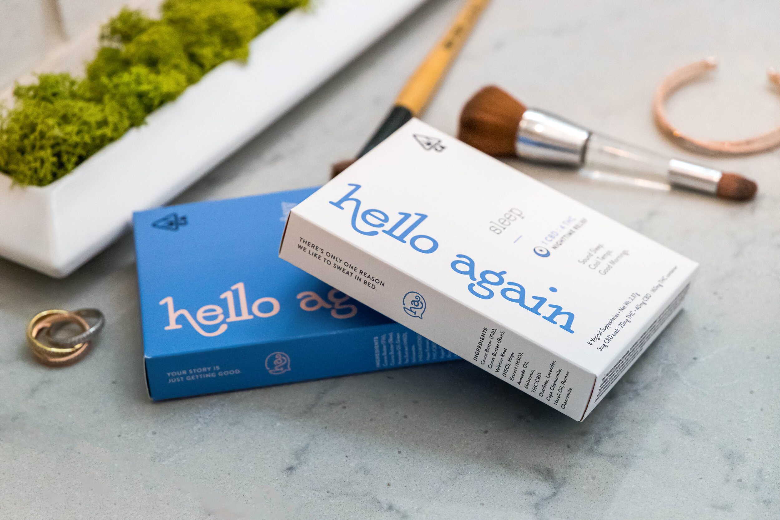
Self-confidence is infectious, and Hello Again’s got it. A perfect accompaniment to the wordplay and irreverent humor of the brand voice, the visuals are comprised of cheeky illustrations, indulgent colors, and bold graphics.

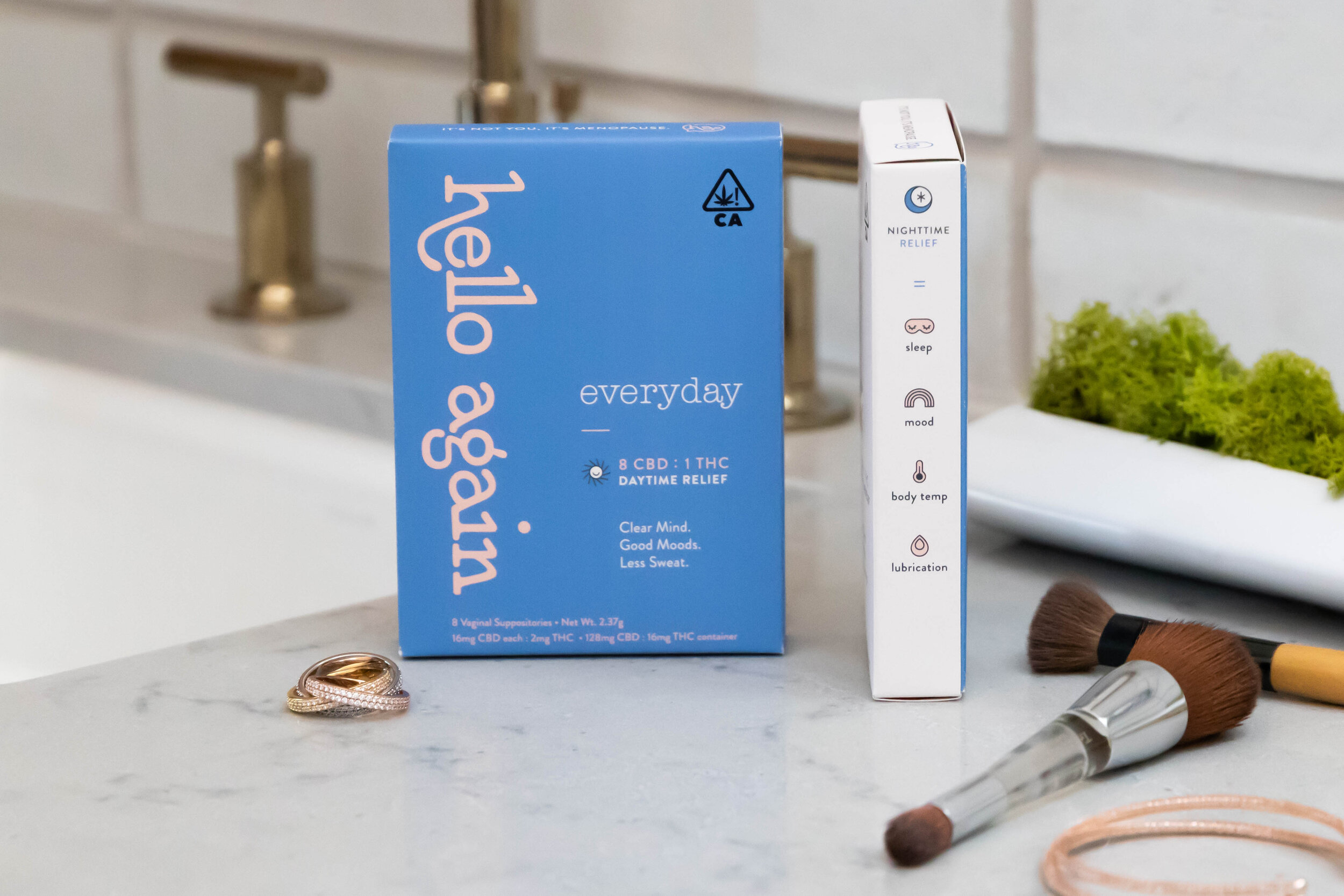
Packaging
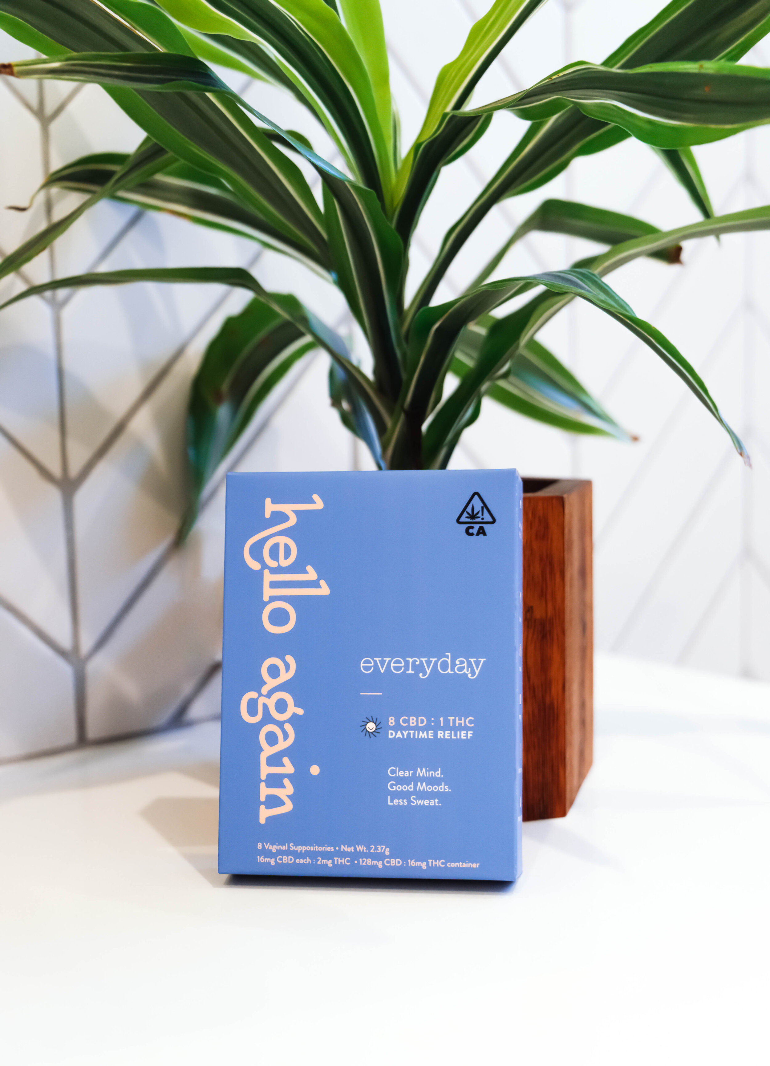
In a crowded dispensary space, the HA packaging needed to do double duty—standing out on-shelf and educating shoppers and budtenders alike. Pulling from the vibrant color palette, we used periwinkle for Everyday and cream for Sleep to catch shoppers’ eyes.